Millionaires at McDonalds
8/5/14 / Matt Bruce

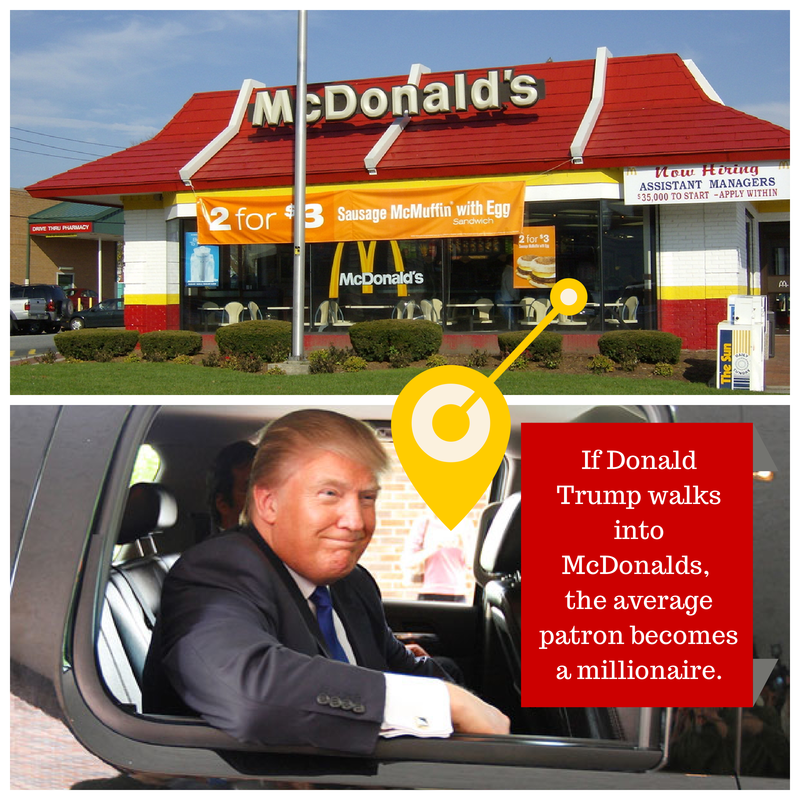
When Donald Trump walks into a McDonalds, the average patron in that restaurant becomes a millionaire. Is this true? With a few calculations and assumptions, we can find out.
Forbes Magazine estimates that Mr. Trump is worth $3.9 billion (as of July, 2014). We will assume 70 million people eat at McDonalds daily and that there are 35,000 restaurants worldwide. If it takes 15 minutes to pick up an order, then there are about 21 customers in every restaurant at one time…on average. Let’s assume that every patron, aside from Mr. Trump, has a net worth of $45,000 (the median American net worth is $44,900). Based on these figures, we can calculate the average net worth of these customers.
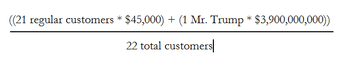
The result? The average customer at that McDonalds is worth $177 million. In fact, there could be up to 4,000 customers crammed into that restaurant with Mr. Trump and the average patron would still be a millionaire. Does this finding resonate with you? It smells a little fishy to me—or is that the day-old Filet-O-Fish?
The fact is, when Mr. Trump walked through that grease-stained door, the average customer became a multi-millionaire. However, should we assume that all customers at this McDonalds are very wealthy? Probably not. The trouble with the above calculation (besides the extremely low probability that Donald Trump would ever walk into a McDonalds), is that Mr. Trump’s net worth is an outlier—his extreme wealth is very different from the rest of the population, and adding him to the pool of all customers has a huge influence on the average net worth. It is like adding a bulldozer to your team while playing tug-of-war; one additional player (with the capacity to pull 100,000 pounds) makes a huge difference.
When analyzing data, how can we consider and/or adjust for the influence of outliers? Below, I outline two steps and three subsequent options.
Step 1: Outlier detection
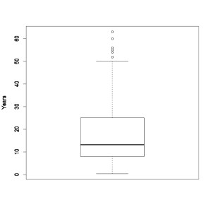 The first step one should take is to look at the data graphically. Most statistical software programs can produce boxplots (also known as box-and-whisker plots) that display the median (mid-point) and inter-quartile range (the points in the middle 50% of the dataset), as well as mathematically identify outliers based on pre-set criteria. The boxplot below represents years lived at current residents for a survey we recently completed, it displays the median (the thick line), quartiles (the top and bottom of the box), and variance (the top and bottom lines at the end of the dashed line). The six points above the top line are identified as outliers because they are greater than 1.5 times the interquartile range plus the upper quartile—a simple calculation that can be completed by hand or by using a statistical software package.
Step 2: Investigate outliers
The second step is to investigate each outlier and try to determine what may have caused the extreme point. Was there a simple data-entry error, a misunderstanding of the units of measure (e.g., did an answer represent months rather than years), or was the response clearly insincere? When the outlier is clearly the result of a data-entry or measurement error, it is easily fixed. However, outliers are often not easily explainable. If you have a few head-scratchers, what should you do?
Option 1: Retain the outlier(s) and do not change your analysis
Extreme data are not necessarily “bad” data. Some people have extreme opinions, needs, or behaviors; if the goal of research is to produce the most accurate estimate of a population, then their feedback should help improve the accuracy of results. However, if you plan to conduct statistical tests, such as determining if there is a reliable difference between two means, then keep in mind that the outliers may substantially increase the difference in variance between the two groups. Generally, this approach is defendable, although you might consider adding a footnote mentioning the uncertainty of some data.
Option 2: Retain the outlier(s) and take a different approach to analysis
You might find yourself in a situation where you want to retain all unexplainable outliers, but you want to report a statistic that is not strongly influenced by these outliers. In this case, consider calculating, analyzing, and reporting a median rather than an average (i.e., mean). A median is the mid-point of a dataset, where half of respondents reported a value above the median and half of them reported a value below it. Because we calculate medians based on the rank and order of data points rather than their aggregation, medians values are more stable and less likely to swing up or down due to outliers. You can still conduct statistical tests using medians instead of means, but typically, these tests are not as robust at the equivalent mean tests.
Option 3: Remove the outlier(s)
The third option you might consider is removing the outliers from the dataset. Doing so has some advantages, but possibly some very serious consequences. Again, outliers are not necessarily bad data, so removal of outliers should only be done with strong justification. For example, it might be justifiable to remove outliers when the outliers appear to come from a different population than the one of interest in the research, although it is typically best to create population bounds during the project design process rather than during data analysis.
As we saw in the case of Donald Trump walking into a McDonalds and turning everyone into a multi-millionaire, one or a few outliers can have a dramatic influence over results, specifically population averages. If you have a dataset that you would like to analyze, consider taking the time to identify outliers and their contexts. By carefully considering how outliers might influence your results, you can save yourself a lot of time and head scratching. Of course, feel free to give us a call if you would like us to collect, analyze, or report on any data.