Good Graph, Bad Graph
4/25/25 / Sam Keating

Bad graphs and charts are everywhere. We’ve all seen them—in news articles, in business reports, on social media—and we often know them when we see them. For example, if you saw a pie chart that summed to over 100%, you would probably at least realize that something is off, even if you don’t immediately recognize the issue. So, what makes a graph “good”? To understand that it’s probably easier to look at what makes a graph bad.
In this post, we discuss three ways graphs can be misleading, difficult to read or unclear. In each case, we give a side-by-side comparison of both bad (or at least, less ideal) and their better counterpart.
Inappropriate Graph Type
At times, you may see a graph that is, at surface level, perfectly fine. It conveys the information you need, and you’re able to understand the information. But maybe it could be presented in a way that makes the information easier to interpret and understand.
For example, take these two graphs created using data from the Colorado State Demography Office, showing the percentage of the Front Range population in each age group.
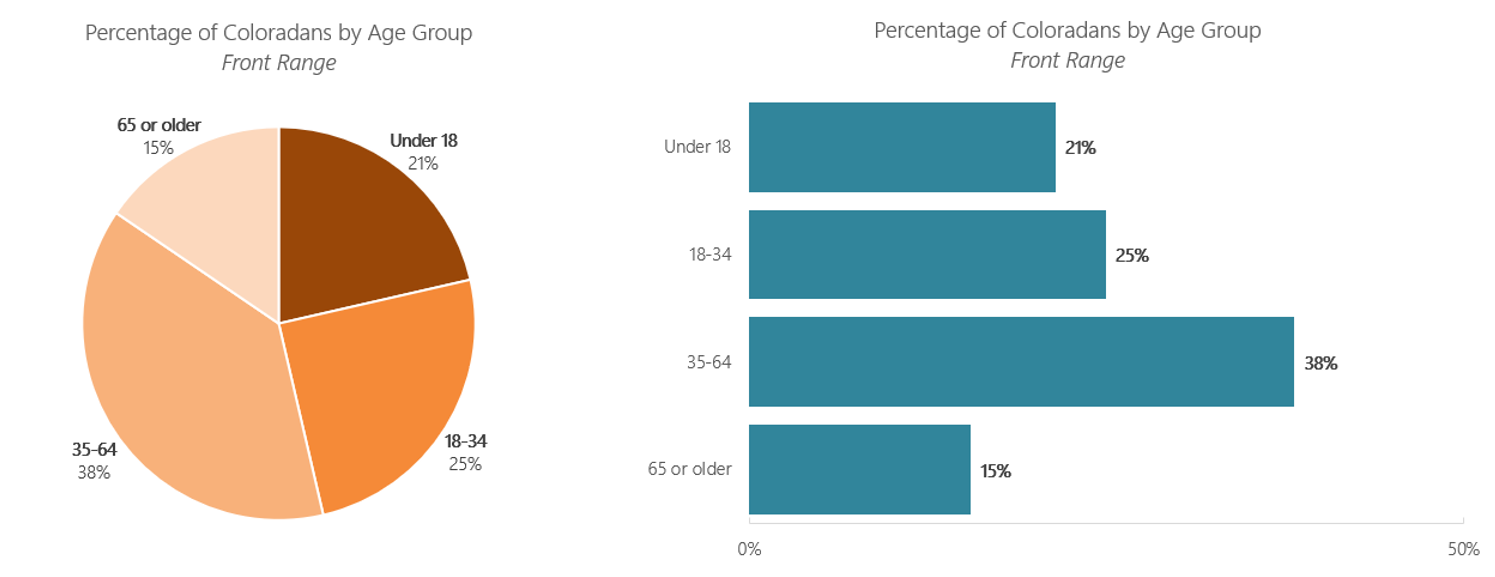
There’s nothing inherently wrong with the first graph—it’s a pie chart that sums to 100%, but it’s difficult to really see the differences between the groups (the Under 18 and 18-34 segments look about the same in size.)
However, if we take the same data and plot it as a bar graph, the differences in segments become a lot clearer. The Under 18 and 18-34 group difference is immediately clear, whereas it takes a few additional mental steps to see the same in the pie chart.
Inappropriate Scaling
Next, we’ll look at how the scale of an axis can impact your interpretation of a graph, using data on the percentage of Coloradans who reside in the top 5 most populated counties in the state.
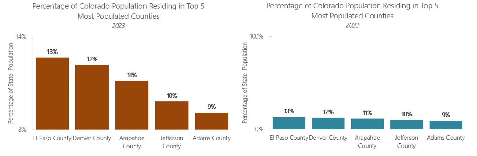
The vertical axis on the first graph starts at 8% and ends at 14% making the differences in percentages appear much more substantial than the reality. In contrast, the vertical axis in the second graph starts at 0% and ends at 100%. While in the first graph, 10% appears to be about half of 13%, the second graph better reflects how similar these proportions really are.
Ineffective Color Use
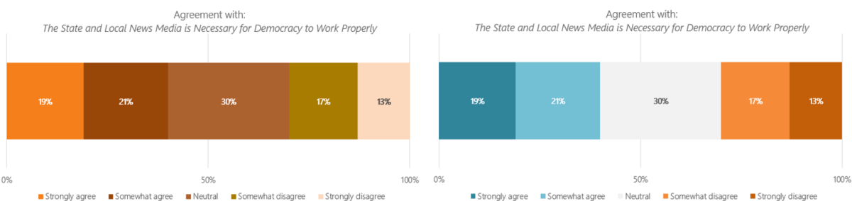
Again, we’ll look at a graph that isn’t inherently wrong, but could be improved, this time using data from a survey we fielded for the Colorado Media Project.
.
In the graph on the left, you can read it and understand the percentage who agree and the percentage who disagree. However, the use of colors does nothing to convey this information, so a few additional mental steps are needed to interpret the graph. In the graph on the right, the color choices are more intentional—blue indicates agreement, grey indicates neutrality, and orange indicates disagreement. While referring to the legend is still needed to fully interpret the graph, it is apparent that the use of color conveys meaning.
Additionally, when making graphs like this, it is important to take accessibility standards into account. Using green for agreement and red for disagreement is commonly seen, but difficult for people with color blindness to differentiate. Blue and orange are generally more colorblind friendly. Online tools can be used to test if your color choices meet accessibility standards.
When making charts and graphs, it’s best to take the perspective of someone who is totally unfamiliar with the data and content. Make things easy on your audience—good visualizations should communicate clearly and quickly.