What is data storytelling?
7/30/20 / Caitlin McAteer

While researchers hope that everyone is as fascinated with their research findings as they are, most people do not have time to read through long reports with dense paragraphs of complex findings, graphs, and charts. Leaders and executives need to know the most important research findings so they can implement data informed and strategic next steps. Here is where effective data storytelling comes into play. Data storytelling is another way of saying data visualization. However, data storytelling is a step beyond data visualization because it involves taking research findings and transforming them into a visually appealing summary sheet that paints a picture of what the findings are, why they are important, and what they can be used for. You might have heard of the dashboard, one common and effective data storytelling style of report.
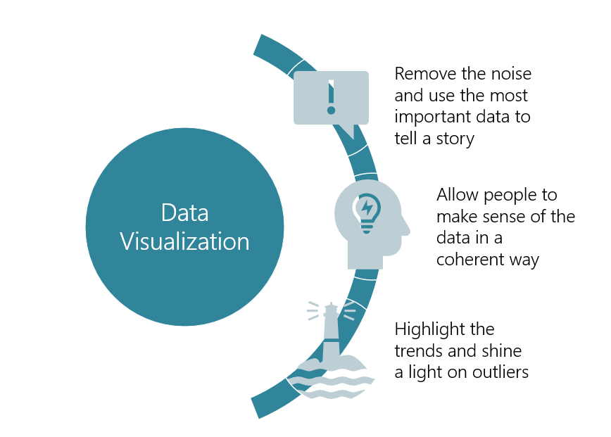
A data story typically involves a visual presentation of data that can easily be created with visualization tools like those available with the simple Microsoft Office package or with a more advanced tool like Tableau. Overall, data storytellers are often charged with the task of revealing useful and hard-hitting data in a manner that is cohesive and captivating. Quality data visualizations that effectively tell a story do so by removing the noise, making sense of the data in a coherent way, and highlighting trends.
What is blended storytelling?
Blended storytelling exists when a person wants to present both quantitative information that can be put directly into charts and graphs, such as survey data, as well as anecdotal data, which includes observations, interviews, or focus groups.
Data storytelling becomes more complex when both types of data (anecdotal and quantitative) are included for three reasons. First, anecdotal data is much more difficult to visualize because it is often unique to a specific context and quite nuanced. Second, there are no simple and easy tools that can generate graphics of anecdotal data. Third, a blended data approach, when done well, has charts and graphs presented alongside anecdotal evidence rather than in separate sections of the same report.
In a blended storytelling approach, anecdotal data must be processed into visuals that are as captivating as the other data and create a cohesive report that provides narrative to the overall data story. Here, an idea of how you’d like anecdotal findings to fit alongside your more numerical data can help inform what sort of visuals you choose for presenting your blended data approach and crafting an intriguing and memorable story.
How do you craft a blended data story?
When considering how to present such blended findings, we begin by reflecting on what the data story is telling and how we can highlight different findings to help tell this story. Therefore, we begin to blend data to produce deeper and more enlightening insights by asking whether we want our qualitative data to 1) help explore potential trends through a tool like a survey, 2) offer clarification of a chart or graph by adding in someone’s voice, or 3) narrate a more complete story by showing how two data types reveal different findings.
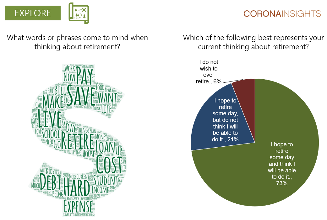
If our goal of visualizing blended data is to explore a new topic, the resultant blended story may show anecdotal data visualization next to a chart to demonstrate how qualitative findings helped to inform additional quantitative research methods.
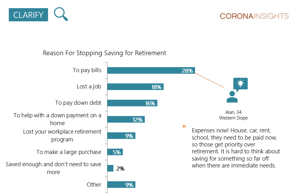
When our goal is to clarify trends that we already feel we know, the visualization may include a chart with a call-out quote that demonstrates how qualitative methods were used to further explore previously collected quantitative findings and humanize the data.
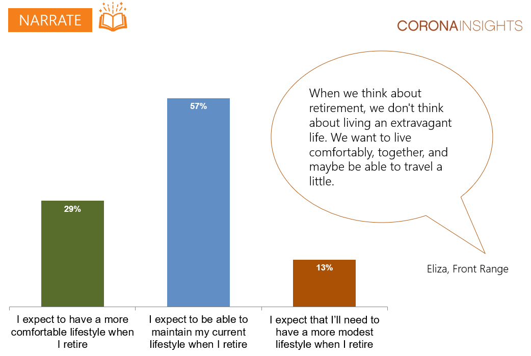
Finally, if our aim is to narrate a cohesive story, we may place quantitative and qualitative data side-by-side to demonstrate how, without one of the two approaches, the data story would be less complete.
What advice is most useful for blended data storytelling?
When approaching visualization for blended data storytelling, we hope you remember the following three things:
- Aim to visualize your results in terms of a complete data story that blends data sources rather than organizing it by type of information alone;
- Allow yourself to play around with the visual presentation of your data story; and
- Don’t be afraid to think outside the (text)box when presenting anecdotal findings results.