Beer and politics
10/19/12 / David Kennedy
While we typically steer clear of politics here, preferring to remain the unbiased, neutral party, we do not steer clear of items related to beer.
Four years ago, I posted a blog post about the numerous alternative polls being used to predict the election, from Halloween masks to cookies.
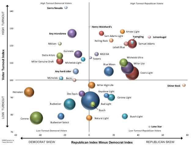
This year, instead of showing more unique polls, this graph of beer, political leanings, and voter turnout caught our eye.
Bubble chart based on Scarborough Market Research data, which includes 200,000 interviews with American adults.
You could probably stare at this chart for a while dissecting each brand and telling a story about it. For some brands it may be more a matter of geographic availability than brand attributes, while others may follow their stereotypes.
For us Coloradans, our favorite beer probably isn’t represented above considering the number of micro and craft breweries in the state (putting all micro-and presumably craft beer-into the “any micro” category probably over simplifies things). In that regard, maybe the chart does reflect reality…Colorado is a swing state in this election.

