Social Distancing: How Are We Doing?
4/10/20 / Matt Herndon
One of the biggest challenges in tackling the COVID-19 situation has been the lack of accurate data about the situation. While various models can be helpful to understand what’s going on and to forecast how things will play out, it has been very difficult for public health officials to fully understand how contagious the virus is, how deadly it is, and how it spreads.
It has also been difficult to get a feel for how well social distancing efforts have been working, but that is beginning to change through some interesting uses of data that already exist. Google has, for years, collected location data through Google Maps users that forms the basis for its various traffic measurements and forecasts. Now, Google has found a way of using that same data to create a “report card” of how well communities across the country are cutting down on their social distancing.
You can find all of the reports on Google’s COVID-19 Mobility site, but here are the results for Denver (through March 29th):
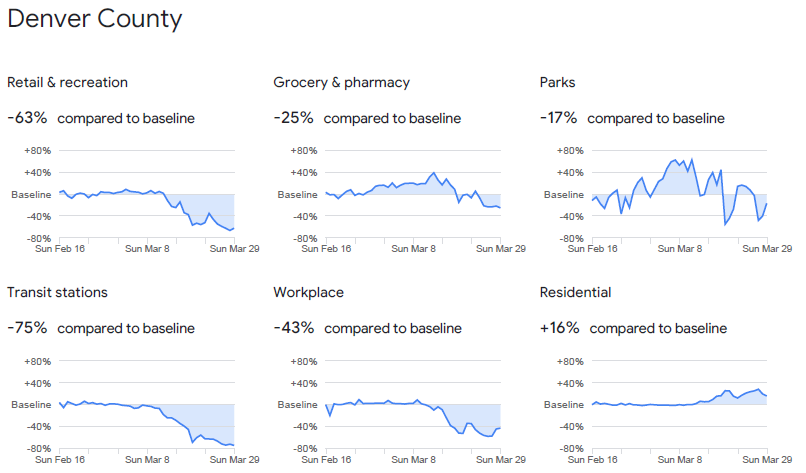
Overall, Denver has been doing a great job of shutting things down, and the county has been one of the best in the state in terms of reduced retail and recreation. Use of public transit has also declined dramatically, and even visits to grocery stores and pharmacies are down despite the “essential” nature of these businesses.
There’ s a long way to go before we’re out of the woods with the pandemic, but tools like these can make use of data that already exists and to help public officials make the best decisions they can to help bring us out of the situation.