Are We “Flattening the Curve?”
4/16/20 / Matt Herndon
For better or worse, I consider myself to be somewhat “anti-news.” That doesn’t mean that I hide under a rock and pretend like nothing is bad (or good!) in the world, but I personally have a lot of trouble really understanding what is going on when information is filtered through someone else’s attempt to simplify a complex situation down so that everyone can understand it.
Trying to follow the COVID-19 situation is no different. There are hundreds (thousands?) of news articles every day about how we’re doing, and a lot of it is contradictory. How do you filter through all the noise and understand what’s truly going on? I’d like to show one resource (among many) that I find to be helpful in drawing my own conclusions about the situation: Covidly.com.
Now, before we go any further, it’s important to acknowledge that this site doesn’t get around the issue that everyone’s having right now – poor data quality. It pulls data from other sources around the world, so if the data coming in is flawed, it’s not able to correct for that. But for a simple overview of what’s going on, it’s about as good of a source as people in the general public have at our disposal.
First, if all you want is a simple “how well are we doing,” each country is assigned a “health score” from 1 to 9 (where 1 = really bad and 9 = really good), and you can hover over the number to read the definition of each score. For the record, they have the U.S. at a “5” today, which isn’t great, but is a lot better than the “2” we were at a couple weeks ago.
What I personally find to be very helpful, however, is…graphs! (I know, try to contain your surprise that a numbers guy loves graphs.) You can find graphs at both the national and state levels, and if you’re a true numbers geek like I am, there are customizations galore. I won’t go through every chart, but here are a couple that I personally find to be helpful.
Daily growth
First, how are we doing at slowing the rate of infection? You can look at the raw numbers (and the CDPHE has a great site for doing that), but it’s sometimes hard to really spot the trends in looking at the data that way. However, if you plot the total case on a logarithmic scale, you can easily see the improvement in terms of slowed growth.
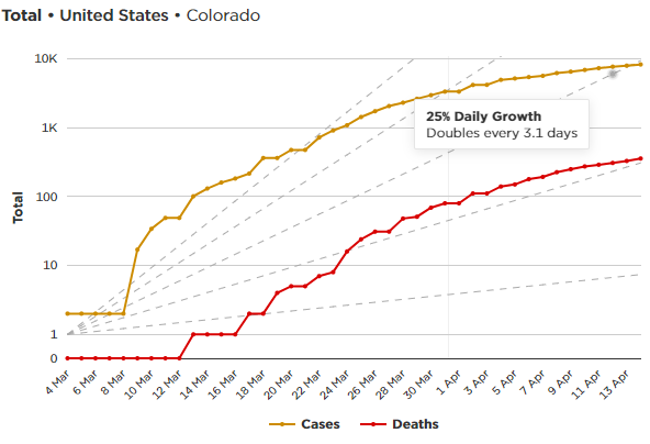
The straight lines show various thresholds in terms of percent daily growth. On March 23rd, for example, we were right on the top line, which shows 45% daily growth (cases double every 1.9 days). As of April 15th, though, we’ve gotten that down to 25% (cases double every 3.1 days). Are we out of the woods yet? Unfortunately, no. But we are making progress, and hopefully things will continue.
Growth trajectory
If you’ve made it this far, hopefully you’ll forgive me for talking about one other chart that is really hard to wrap your mind around, but really informative in what it shows. (It’s complicated enough that it’s probably easier just to suggest you watch this video, which does a great job of describing it.)
If you’re impatient and don’t want to watch the video, the basic gist is that it really makes the most sense to look at growth in terms of change over existing cases rather than over time since a virus’s growth is naturally linked to how many people are out there infecting other people. The goal is to come off of the line of exponential growth (which is roughly what we saw in New York until recently), and if we are successful in truly “flattening the curve,” we should see the line drop near vertically.
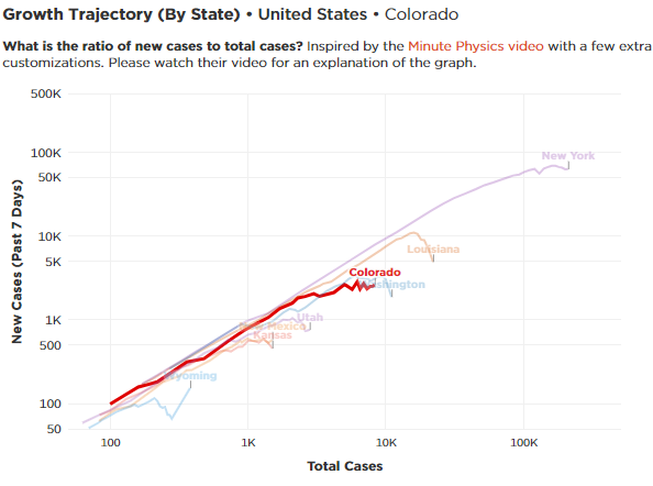
I filtered the chart to just show Colorado, our neighboring states, and a couple of the “hot spots” we’ve seen nationally. As you can see, Louisiana and Washington, which were both growing rapidly, have been able to slow things dramatically (as evidenced by the steep drop in their lines). New York is starting to curve toward a flatter trajectory, but we aren’t yet seeing the rapid drop that will signal that things are coming under control.
For those of us in Colorado, the story is becoming more positive, but we still have work to do. Our line has flattened out, but we still aren’t seeing that big drop we would expect if things were truly coming under control. Ideally, we’ll see that in the coming weeks, though!
~
Hopefully this gives you a tool you didn’t know about to dive in and understand the situation. While by no means the only resource you can use to keep up on the situation, it has so many ways to customize how you look at the data, making it a great way of looking at the situation from a variety of angles to draw your own conclusions.