Visualizing data: 5 Best practices
10/15/15 / David Kennedy

Visualizing data, whether through graphs, infographics, or other means, has grown in importance as both the amount of data and the tools to interpret data have both increased. The goal of any graphic should be to tell a story, but it is easy to allow that story to be sidetracked by poor design. So, what are some common principles to keep in mind no matter what graphing software you’re using? Read on.
First, this blog post is meant to be more nuts and bolts than big picture philosophy. Knowing your audience, their information needs, time constraints, big picture goals, and so on should be your first step. At the same time, this isn’t a step-by-step how-to either. Specifics on how to change colors, fonts, or other options in your software of choice isn’t covered here. So consider this a guide for what lies in between: ideas on how to strengthen your visuals to tell the story you want to tell.
1. Communicate one point per graphic
This rule is often invoked for PowerPoint slides too. Decide what the important piece of information is and then communicate it. Use subsequent graphics to continue the story, if needed, rather than trying to communicate everything at once. In showing too much, your viewer may miss the point you originally had wanted to make.
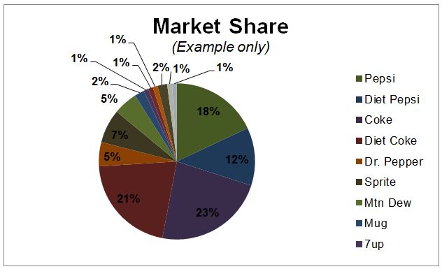
Lot’s of conclusions could be drawn from the above graph, but which are you trying to make?
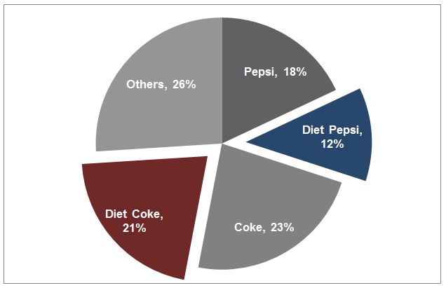
Below, it becomes clearer that we’re wanting to compare Pepsi’s and Coke’s main brands.
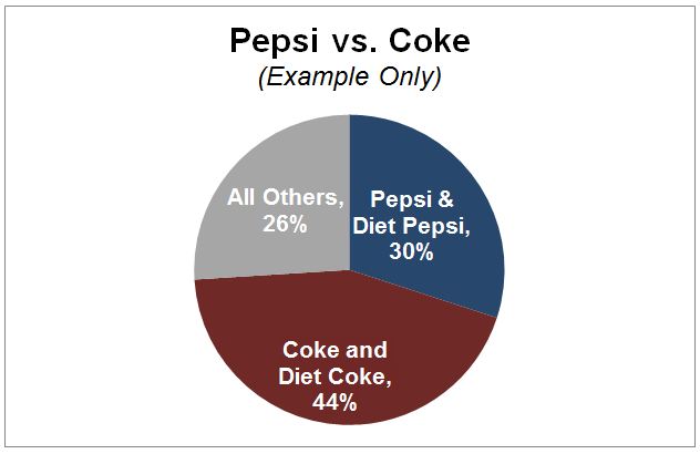
And yes, we’re understand that pie charts are the worst.
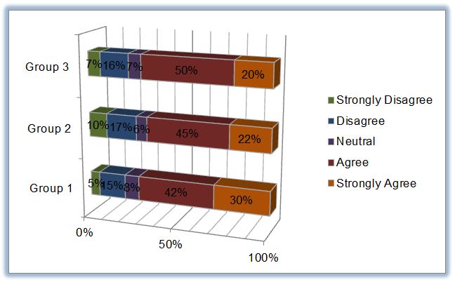
2. Go light on text
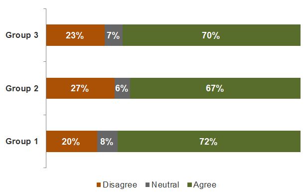
A strong visual can stand on its own. Don’t overwhelm the viewer with lots of text to read that only repeats what is already clearly shown. If needed, use text to emphasize the main takeaway only.
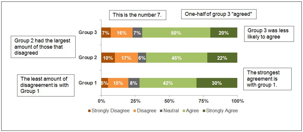
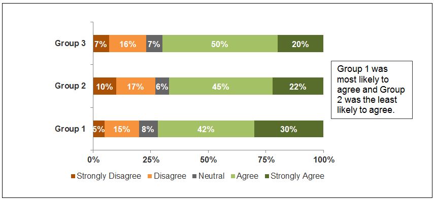
Essentially, the text above is the graph in text form. Below, while the reader can still see all the differences, you’re drawing their attention to the finding you feel is most relevant.
3. Stick with San Serif fonts
Don’t know the difference between Serif and San Serif fonts? Click here. Use the latter in labels as they are easier to read.
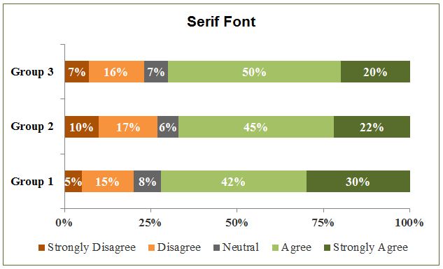

The difference may be subtle, but the san serif font is a little cleaner and easier on the eyes.
4. Use color wisely
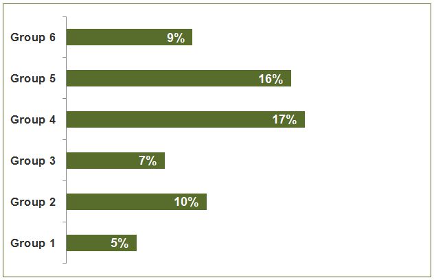
Color can help communicate your point and draw a viewer’s focus. For example, colors could coordinate with competitor brand colors, or you could only use color on the finding you want to draw attention to, or maybe contrasting colors to highlight opposing views makes the most sense. Whatever you do, don’t use color indiscriminately, and don’t let your software select it for you.
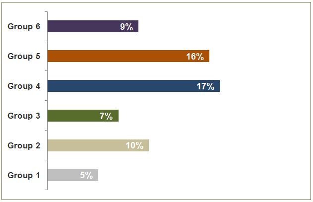
Above, color is randomly assigned. It can make a graph look busy and it may even suggest the color is trying to say something. Below, the graph is simpler and not distracting.
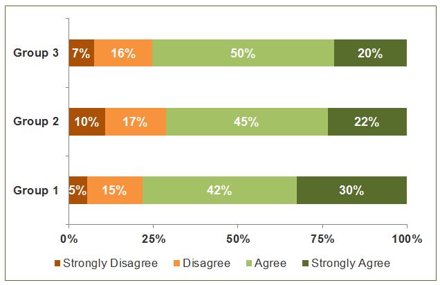
In the next example, we use shades of green to show agreement and shades of orange to show disagreement. While there are four categories of responses, you can quickly see where there is more agreement vs. disagreement just by glancing at the graph.
Using cool vs. warmer colors also aids this contrast.
If, for example, we only wanted to talk about a specific segment, we could use spot color to highlight only those results.
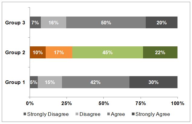
A few other notes on color: Be mindful of how it will look in various media. Some printers, screens, and projectors may not produce color the same way as you see it on your screen. Orange may look brown, or the difference between blue and green will be washed out. Also, remember that some people may be color blind or that your charts may be reproduced in black and white. Take additional steps to make interpretation easy, such as making sure your legend is ordered in the same way as graph bars.
5. Keep it clean
A lot of graph programs add everything including the kitchen sink to your graph. Legends, axis labels, data point labels, and so on. Furthermore, they give you a lot of options do spice it up even more. But you probably shouldn’t.
The kitchen sink…
Less is more…
~
We often write about making graphs. Check out some of our other posts on the topic: