DIY Tools: Network Graphing
3/29/16 / Beth Mulligan

Analyzing Corona’s internal data for our annual retreat is one of my great joys in life. (It’s true – I know, I’m a strange one.) For the last few years I’ve included an analysis of teamwork at Corona. Our project teams form organically around interests, strengths, and capacity, so over the course of a year most of us have worked with everyone else at the firm on a project or two, and because of positions and other specializations some pairs work together more than others. Visualizing this teamwork network is useful for thinking about efficiencies that may have developed around certain partnerships, and thinking about cross-training needs, and so on. The reason I’m describing this is that I’ve tried out a few software tools in the course of this analysis that others might find useful for their data analysis (teamwork or otherwise).
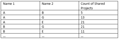
For demonstration purposes, I’ve put together a simple example dataset with counts of shared projects. In reality, I prefer to use other metrics like hours worked on shared projects because our projects are not all of equal size, and I might have worked with someone on one big project where we spent 500 hours each on it, and meanwhile I worked on 5 different small projects with another person where we logged 200 hours total.
But to keep it simple here, I start with a fairly straightforward dataset. I have three columns: the first two are the names of pairs of team members (e.g., Beth – Kate, though I’m using letters here to protect our identities), and the third column has the number of projects that pair has worked on together in the last year. To illustrate:
My dataset contains all possible staff pairs. We have 10 people on staff, so there are 45 pairs. I want to draw a network graph where each person is a vertex (or node), and the edge (or line) between them is thicker or thinner as a function of either the count of shared projects or the hours on shared projects.
This year I used Google Fusion Tables to create the network graph. This is a free web application from Google. I start by creating a fusion table and importing my data from a google spreadsheet. (You can also import an Excel file from your computer or start with a blank fusion table and enter your data there.) The new file opens with two tabs at the top – one called Rows that looks just like the spreadsheet I imported and the other called Cards that looks like a bunch of notecards each containing the info in one row of data. To create the chart, I click the plus button to the right of those tabs and select “Add chart”. In the new tab I select the network graph icon in the lower left, and then ask to show the link between “Name 1” and “Name 2” and weight by “Count of Shared Projects”. It looks like this:
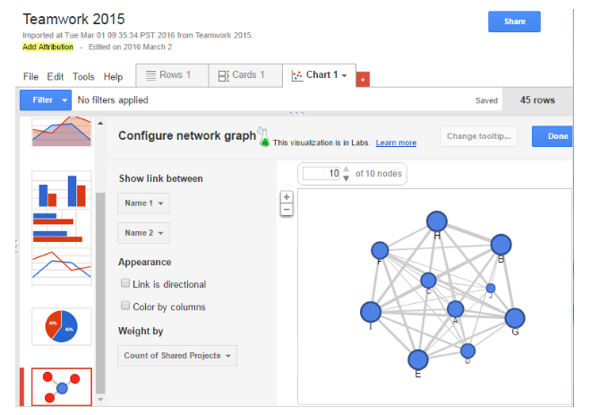
There are a few things I don’t love about this tool. First, it doesn’t seem to be able to show recursive links (from me back to me, for example). We have a number of projects that are staffed by a single person, and being able to add a weighted line indicating how many projects I worked on by myself would be helpful. As it is, those projects aren’t included in the graph (I tried including rows in the dataset where Name 1 and Name 2 are the same, but to no avail). As a result, the bubble sizes (indicating total project counts) for senior staff tend to be smaller on average, because more senior people have more projects where they work alone, and those projects aren’t represented. Also, the tool doesn’t have options for 2D visualizations, so if you need a static image you are stuck with something like the above which is quite messy.
However, the interactive version is quite fun as you can click and drag the nodes to spin the 3D network around and highlight the connections to a particular person.
Another tool option that I’ve used in the past (and that is able to show recursive links and 2D networks) is an Excel template called NodeXL. You can download the template from their website – you’ll need to install it (which requires a restart of your computer) – and then to use it just open your Windows start menu and type NodeXL. Instructions here. I had some difficulties using it with Office 2016, but in Office 2013 it worked quite well.
If you try these out, share your examples with us!